Showing posts with label architecture. Show all posts

10.27.2009

Another Tantalizing Tuesday


Lots of good stuff to report, some from the tech world, some from music, and some from art. How typical of me, wouldn't you say?

Wired Magazine's list of top 8 online mix tape distribution sites.


Article detailing St. Louis and their Complete Street Project. Finally, urban planning that de-emphasizes auto-centric streets.


New York Times article examining the state of conceptual art and the welcoming of former rebels like Jeffery Koons into the establishment.

Google Android is making a grab at the Ipod Touch market with their Archos 5. It looks incredible.

French illustrator over at Nesk.

Ever get tired of pie charts and PowerPoint presentations? Let David McCandless' new book, The Visual Miscellaneum show you information in a colorful new way.


As per the A.V. Club, Tegan and Sara's new album is awesome to the max. Also, Midlake and Los Campesinos! are coming out with new albums in 2010. Oh Huzzah!

10.23.2009

Friday Night Links/P.J.'s Picks


For those who don't remember, "P.J." stands for Philip Johnson. I picked him as my imaginary blogging buddy mostly because I've always enjoyed his trademark glasses and have respect for him as an architect. How can you not like a guy who hung out with Andy Warhol? As it so happens, I've been getting to know P.J. a little better thanks in part to my recent acquisition of The Philip Johnson Tapes. The book is a transcription of interviews with Johnson done in 1985 by Robert A.M. Stern. I have just started the book, but so far it's a very enlightening read. He really doesn't pull any punches when it comes to his opinions about anything. I anticipate a lively interview all the way through.

In other reading news, I just finished Nicholson Baker's, The Mezzanine. Though only 130 pages, it takes a while to go through in part because of Nicholson's extensive use of footnotes. I admit it got a little tiresome after a while, but his sustained concentration on minutiae is amazing. Most of the book revolved around the main character trying to figure out why both his shoelaces broke within a day of each other. He thinks about the different places of stress; at the knot, at the shoes' eye holes, along the toe, etc. in excruciating detail, but rarely do his thoughts become boring. He forces the reader to examine the everyday in a new light, often reexamining the mundane and finding something wondrous about it. How often do you read an author who cares deeply about paper towels vs. air dry hand dryers in public bathrooms? I enjoyed the book, but it is not for everyone. It takes a certain patience, one I admittedly didn't always have.

During breaks in my reading of Baker, I read a short story collection by Jim Shepard called, Like You'd Understand, Anyway. It is one of the most consistent short story collections I've read recently. Normally, a collection has a few gems, a lot of decent, but not great stories, and a couple that are just bad. Shepard held a tight grip on his material and never let it falter, even as he skipped around through history tackling such time periods as Chernobyl era Ukraine, Hadrian's Wall era Roman Empire, and the French Revolution. Shepard's stories, which largely revolve around father/son/brother relationships, always stay emotionally grounded. He never lets the historical period take control of the story. It doesn't matter what year the story takes place, relationships between men are always they same and, in Shepard's worlds, always failing. Definitely a book worth checking out, even if you aren't a big lit reader. It's very straightforward and lacks any kind of tricky post-modern elements. It's just a solid read. Period.


Last weekend Treasure Island, in the San Francisco Bay, held its second annual music festival. The island was originally built in 1939 for a World's Fair and fell into disuse shortly after World War II. There was been a lot of argument over the years about what to do with the man made island. Current plans call for a small sustainable city to be built. San Francisco always seems to be the most progressive West Coast city when it comes to social policy. Some message board posters have criticized the city for concentrating too much on environmental issue while ignoring larger concerns such as crime and safety. While I certainly don't want crime, I think that's something I'd rather put up with than cancer induced by chemical/pollutant exposure.

Forgot how I found the site, but The Projectivist is a great blog about art and graphic design.

Tatsuro Kiuchi is a Japanese illustrator of immense talent. In addition to his portfolio site, he also has a blog. Check it out, yo!

The Metro Library and Archive has an online database of Los Angeles maps, each detailing proposed public transit routes over the years. It gets depressing when you realize L.A. could have had its "Subway to the Sea" way back in the 1970's.

Syllabus for the Net Generation via McSweeney's.

San Francisco's plastic bag ban has worked and might be extended to include banning paper bags, some residents pissed.

Barnes & Noble is taking dead aim at Amazon's Kindle with their new e-reader device, Nook.

When was the last time you talked to your cousin, Frodo?

"Good Magazine" Associate Editor and all around swell guy Patrick James has a Twitter. Read it before it reads you.

10.05.2009

Friday Night Links/P.J.'s Picks: Monday Edition

I finished Michael Chabon's Maps and Legends: Reading and Writing Along the Borderlands over the weekend. Not the most interesting book in the world. The first essay,"Trickster in a Suit of Light , starts the book on a high note as it explains Chabon's stance on so-called "genre fiction" and "literature." The premise of the essay was that entertainment has gotten a bad rap over the years because we have limited its definition. Entertainment has come to mean mindless action movies and formulaic sitcoms. That isn't all entertainment is and can be, that's just what we've let it become. Writing, Chabon contents, is also entertainment and that giving writing such a label isn't derogatory, but merely a description of its basic function. He says, "I'd like to believe that, because I read for entertainment, and I write to entertain. Period."

He goes on to define entertainment in its broader sense and finds it quite apropos when applied to writing.

"The original sense of the word "entertainment" is a lovely one of mutual support through intertwining, like a pair of trees grown together, interwoven, each sustaining and bearing up the other. It suggests a kind of mid-air transfer of strenght, contact across a void...I can't think of a better approximation between reader and writer."
The above quote is more or less the thesis for the entire collection of essays, though I felt it wasn't always supported all that well. A couple of the essays were only five or six pages long including, "Landsman of the Lost" which was about American comic strip writer Ben Katchor. The essay gives a brief account of how and why Chabon is interested in the man and then talks about what he did for the essay's remaining four or five pages. This essay, like many in the collection, felt cursory, more recollections than analysis. Chabon often talks of his childhood and liking comics and having various religious and identity crises, but none of it felt all that personal. I never felt that I was getting to know him better as a writer. The essays felt like facts, I was getting a list of things Chabon likes without really understanding their relationship to him or his writing.

The most compelling essay, "Imaginary Homelands," deals with Chabon's Jewish identity as awriter, how that informs his writing, and how an essay he wrote about a Yiddish dictionary angered a lot of scholarly Jews. It was the first time I felt Chabon was intimately discussing something that was important to him and how personal aspects of his life affected his public output as a writer. Plus, it dealt with etymology and language, which is always a point of interest to me. I wouldn't say this essay alone is worth the cost of the book, but it does finally reveal something about the author, which I had been waiting 157 pages for. I have not given up on Chabon as a fiction author. I've read his short story collection A Model World and hope to pick up Wonder Boys sometime soon. In the meantime, I'll stick to other more convincing essayist fare.


LINKS:

Good Magazine has several good articles, one of which claiming that 2009 is one of the best years for the novel we've seen in a while. Pynchon's new novel, Inherent Vice, is proof enough. For a list of must-read novels from 2009, none of which I've read (for shame!), click here.

The lucky bastards in Belgium have not only a kick ass train system, but a new central terminal decigned by Santiago Calatrava.

A new study has found that Mother Earth has tapped out and it's all because we put her in a choke hold. Now we're all going to die. Good going, citizens of Earth.

826 National, in addition to offering outstanding free tutoring services to children around the country, also has an unbeatable line of products including antimatter, robot emotions, and existentialist wine. To celebrate the organization's amazing products and its design/development team, 826 has put out a book entitled, Essentially Odd. It can be purchased at the 826 National website.

9.25.2009

Friday Night Links/P.J.'s Picks

My reading streak continues at a rapid clip. This week's schedule includes Denis Johnson's Jesus' Son, Nicholson Baker's The Mezzanine and Michael Chabon's, Maps and Legends. I've found that reading three books simultaneously isn't nearly as distracting or disorienting as I had previously found it to be. I think it helps that one book is a short story collection and the other essays, making it easier to keep track of the information. I find switching between books at a whim makes their respective writing styles richer and more distinct. Each book's style helps set off the next. Plus, it allows me a break if the reading gets too intense. While entertaining and thoroughly enjoyable, sometimes the minutiae obsessed Baker can get a little taxing, so I switch over to the more direct prose of Johnson. Anyway I slice it, I feel my reading is worthwhile both in entertainment value and as templates for my own writing.

In Nor Cal news, the new Bay Bridge is rushing toward completion which means the old Bay Bridge is nearing its end. Fear not concerned citizens, the entire bridge is not being torn down, just the eastern span that stretches from Oakland to Yerba Buena Island. The stretch from Yerba Buena to San Francisco is staying intact save for some seismic retrofitting. The new eastern span is being dubbed a Skyway because it lacks the caged support system of the current bridge and affords uninterrupted views of the Bay.

The official Bay Bridge construction website has all the details, including the eventual dismantling of the eastern span. However, as Newton's Third Law of Motion states, "for every action there is an opposite and equal reaction." What is the reaction you ask? Well, many forward thinking city planners are proposing to keep the old eastern span of the bridge and turn it into a hanging city of sorts, similar to that of New York's High Line. There is also some historical precedence to the idea which is outlined quite extensively in both Streetsblog San Francisco and BldgBlog.

I'm unsure of how practical it would be to build a city on a structure deemed unsafe to drive across, let alone live on. There are lots of kinks to work out, obviously, but it's a forward thinking plan that promotes reuse rather than outright destruction which works on both an economic and historic preservation level. I highly doubt that plan will ever happen, but it can only help in the ongoing fight against waste.

Last year I went to D.C. and spent a lot of time looking through the various Smithsonian museums as well as all the usual touristy places. A museum i failed to go to only because I didn't know existed until late last week was the National Building Museum. How cool is that? I feel all giddy and geeky just thinking about it. le sigh. le swoon. Perhaps if I had explored ArchiAtlas earlier I might have known.

Bonus Link:
Grain Edit is a graphic design fetish site that focuses on work from the 1950's through the 1970's. Most excellent.

9.14.2009

Friday Night Links/P.J.'s Picks: Monday Edition

Los Angeles has been called a city without a center, a sprawling metropolis with no real core. There is nothing within downtown L.A. that draws people in. Other major cities around the country like New York, San Francisco, or Chicago have urban cores that are more than just high rises, but a vibrant part of the cities' social and cultural scene. There is a mix of business and residential districts that keep larger swaths of the city vibrant and open beyond the 9-5 business hours. Los Angeles' downtown largely lacks such dynamism. Bunker Hill, the new downtown, is all office buildings and offers little in the way of social activities. MOCA, located in the heart of Bunker Hill, offers evening programs and the Grand Avenue Redevelopment Project offers some hope, but those plans are a long way off especially during our economic crisis.
The latest project to bring some vitality to downtown is the L.A. Live complex just across from the Staples Center. The entertainment behemoth includes L.A. Live Nokia Theater, Club Nokia, Lucky Strike Lanes, Nokia Plaza, the Conga Room, and a move theater. And opening sometime in 2010 is the L.A. Live Ritz Carlton.


OPENING PARAGRAPH of L.A. LIVE MAIN PAGE

Imagine being "in the moment" - when nothing else matters but what is going on around you right then and right there. It is when you experience something so fully you do not think about it or analyze it, you just enjoy it. The moment is that magical place where you scream the loudest, laugh the hardest and live the fullest. This is the L.A. LIVE experience. As a one-of-a-kind entertainment campus, L.A. LIVE is a genuine world-class sports and entertainment destination where one can experience moments like this all the time.


Nokia Plaza. Photo courtesy L.A. Live gallery

The disturbing thing about this promotion is...well pretty much everything about it is disturbing. The whole selling point of the facility is its ability to overwhelm and dumbfound the visitor with so much spectacle that they don't have the time or energy to criticize it. L.A. Live is all spectacle. But what of substance? They have a bowling alley, a theater, two concert venues. It is, as their material says, "a world-class sports and entertainment destination..." Is that what Los Angeles needs? Is that what any city needs? A destination? A destination implies that one travels there, experiences the destination, then leaves. It is an insular experience because everything is located within the campus. While L.A. Live may be booming, what about neighboring businesses, what of the neighborhood around this entertainment campus?

Anyone who has taken a walk down Figueroa St. knows that the area around L.A. Live, Staples Center, and the L.A. Convention Centers isn't pedestrian friendly. It's filled with chain linked parking lots, granite lined office buildings, and buckled sidewalks. Everything is fine within these insular entertainment destinations, but the surrounding streets are left to fend for themselves. These new civic centers that are popping up all around Los Angeles only serve themselves rather than the community at large. They are too busy being destinations rather than integral parts of both the business and cultural structure. Just look at Universal City Walk, The Grove, Americana, The Block at Orange, and the Irvine Spectrum. All of these locations, two of which were designed my maverick developer Rick Caruso (The Grove and Americana), are mini cities unto themselves; a recreation of urban life within the confines of a highly monitored and regulated environment. It is inauthentic and separates it itself from surrounding businesses by way of massive parking lots and high walls. Even with the inclusion of apartments within these facilities, they are still destinations. They are still only places to visit and then leave.

One only has to look at areas like Old Town Pasadena or The Orange Circle, or Santa Monica's Third Street Promenade or any number of small town business districts to find prime examples of retail and restaurant expansion within a pre-existing infrastructure. The benefits of such a system allow for greater integration around the new businesses. The community itself is being upgraded, not just one development. Shops open up, people are out on the streets, crime goes down. The business district expands and more parts of the city get redeveloped and fixed up and become profitable for the region.

The current development trend in Los Angeles gives people few reasons to stay in the area beyond that initial "destination." There is no chance of roaming to other nearby attractions because there are none. There is nothing immediately outside of L.A. Live worth seeing save for a late night meal at The Pantry. City Walk is on a hill, The Grove and Americana all have restaurants within them and are protected from the city by parking lots and apartment buildings. Why recreate a downtowns when there is one already that already exists? One that can be made vibrant and exciting. Perhaps only a novelty plan, but there are talks of bringing a trolley system to run through sections of downtown. This system would allow the burgeoning downtown scene to be traveled more easily and frequented by more people. With Tom Gilmore's big push for lofts in downtown, the older bank and financial districts are becoming filled with residents. Bars are opening up, blogs are being made, and supermarkets are being opened; all signs that downtown, as it stands, is a viable option for future development without sinking millions into flashy and clandestine entertainment centers.

Sadly, most development strategies are based on the bottom line and not much else. It's understandable that investors would want their businesses to succeed, but at what cost is that success coming? What is the long term viability of such a plan if the neighborhood it is built in is going to seed? Westwood Village saw a sharp decline in business after a shooting in 1988. It has bounced back since then, but there is still a stigma attached to the area. How long before something happens to an L.A. Live concert goer walking to their car? What then will happen to these entertainment meccas? In a development plan that includes pre-existing businesses and buildings, everyone will have a vested interest in the area's success and safety. Everyone looks out for each other. City business councils will be created and the business owners will have a say in their future rather than being pushed around by multi-million dollar corporations.

Old Town Pasadena has gone through a remarkable transformation in just under ten years and is continuing to fight for causes it feels important, namely the preservation of small businesses rather than introduction of large chains. Pasadena has realized the stakes involved and has risen to the occasion. It seems L.A. has not yet realized what is at stake and has taken short term financial success of long term viability. It is more than just a question of finance, it is a question of quality and substance. Los Angeles has long battled with critics who claim the Hollywood aesthetic has tainted the culture and turned it into something flashy and cheap. Navel-gazing projects like L.A. Live only lend credence to that claim and proves the city has yet to really care about its heart and core, it has yet to really become anything more than just overwhelming spectacle.


P.J.'s PICKS

I have yet to find the article comparing Chicago to L.A., but basically it says both cities have very similar problems and Chicago is dealing with them in a much more productive manner. Millennium Park and the new Renzo Piano addition to the Institute of Art are proof enough. How did Chicago get so far ahead? One needs to look no further than the past for answers. Specifically, Daniel Burnham's 1909 Plan of Chicago. In honor of its 100th anniversary, Chicago hired Prtizker Award winning architect Zaha Hadid to design a temporary installation in Millenium Park.

Los Angeles was never graced with a master plan, nor was it limited by space like New York or San Francisco. Perhaps that's why it lacks a core. Be that as it may, there were several attempts at urban planning during the city's early days, none of which did much. Information on L.A.'s central plaza and Olvera Street can be found here.

To keep track of urban news in Los Angeles look no further than Every Block Los Angeles, which gives real time news updates based on zip code.

For eco-living tips and L.A. street news, check out Green Girl L.A. and L.A. Streets Blog.

Ever wonder why Wells Fargo has such high interest rates on their credit cards? How else do you expect their execs to party in Malibu?

A quick rundown of Disneyland's ticket prices. Who says money can't buy happiness? Certainly not Disney.

Do you ever listen to folk duos who were popular in the 1960's and wonder what the less popular member of the group likes to read? I know I do. For a full list of books Art Garfunkel has read between 1968 and 2007, please click here. For a list of his all time favorites, click here. For a blistering new track by Macho Man Randy Savage, click here.

7.10.2009

Friday Night Links


Friday Night Lights/P.J.'s Picks:

I swear to you I'm going to put up actual blog posts, but for now you'll have to suffer through another round of links. This week's theme is loosely based around architecture, as seems to be the case quite often around here. These links are slightly more focused in that they deal with architecture and urban design within the scope of environmentalism.

Detractors of environmentally friendly urban planning projects often say that all this environmentalism talk is all attempt to stop global warming which, in their minds, doesn't exist. That, and the government is regulating business and manufacturing in ways it has no right to do. The way I see it, environmentalism is not an ethos or way of life dependent upon a belief in global warming. To me, it's just about common sense. In essence, environmentalists want to keep the world as clean as possible. We have seen that dumping trash into the ocean is not a good idea. Toxins get spread through ocean tides and fish ingest mercury and we ingest the fish and then we ingest mercury. We've seen that if air pollution is not relegated to one place and that wind patterns can carry smog across countries and continents. Dirty one part of the world and, chances are, that dirt will spread elsewhere. What environmentalism tries to do is avoid the spills and messes of the world. It is trying to keep humanity from pissing in the well from which we drink. It's a simple concept and one that promotes a hearty sense of self-preservation. We want to keep the Earth as habitable for as long as possible. As kids, our parents always told us to clean our rooms, doesn't it makes sense that we also clean our planet?

In an effort to jump on this environmental bandwagon and increase long-term sustainability, the city of Los Angeles is embarking on a series of public transportation projects, many of which have been rumored and argued about for years. Plans include more light-rail train routes or extensions of pre-existing routes, trolley service in downtown, bike rentals, and the legendary subway to the sea. All these projects are in their planning stages and require lots of money from a city going broke. While these projects might not even get started into 2011 or 2012, at least there are city planners and leaders who are trying to do something about the traffic problems in L.A. The infrastructure definitely needs some work and I'm glad freeways are being pushed aside for more environmentally feasible options.

"The New York Times" has a two part article about what to do with the inflexible infrastructure of the suburbs and how some economically downtrodden communities are dealing with the closure of "big box" stories. There is also a look at sustainable design for the future including a new phase of pre-fab homes that are vaguely reminiscent of the Case Study Project.

Slightly related and a little more hip is the promotion of chalk and white board paint. What are these marvelous products you ask? Glad you did. They are wall paints that, once dried, double as either a chalk or white board surface. For once it's permissible and encouraged to write on the walls.

And just to keep my literary peeps happy, a link to a pretty comprehensive and fairly well-known site on literature that includes interviews and book reviews.

Lastly, an in-depth article about language and how, more than just a communication tool, it also dictates your perception of the world and overall cognitive processes.

6.29.2009

Mid-Centrury Madness

It's no secret that I am a lover of Mid-Century design. In honor of such a noble period in international design I've assembled a few links and articles of interest about and showcasing the style. You're Welcome.

Mid-Century children's book illustrations

A look at Brutalism, the one part of Mid-Century design of which I am not particularly fond.

A short article about the cyclical nature of design and how 60's kitsch is now the source of inspiration for current "serious architecture."

Architecture Timeline recounted in broad, yet effective terms.


***Bonus Link for the Modern Reader: 879 free songs available for download via Amazon.

6.24.2009

Sketches of Neutra: A Review


About a month ago I made a post about a Neutra exhibit at the Los Angeles Public Library. I finally got a chance to go and it was worth it. The only downside to the experience was having to pay for parking. Yeah, I know, it's downtown, I should expect to pay for parking. But still, you'd think of all places, the main branch of the public library would have a free parking lot. Turns out they don't even own or rent a parking lot. Visitors have to park in a public lot on the street or in an underground lot off Flower St. I'm not sure what good it does to offer free books if it costs money just to get to them. I probably should have taken public transportation, but I didn't have the luxury of time to do so. Anyway, on to the actual exhibit...kind of.

Before I talk about the exhibit proper, I would like to give some major, nerdy ups to the library itself as a building and as a warehouse of information. It's just a fabulous place to get lost in and explore and just marvel at. Some people go to the mall, I go to libraries. Okay, enough with the prefaces...

The exhibit is arranged in chronological order and starts out with a lot of early landscape drawings that include sketches of his travels to South America. Some of his figure sketches were influenced by Gustav Klimt, while his basic drawing ability was largely taught to him by his sister, Josephine. I'm a sucker for sketches of any kind because of their roughness. They show mistakes and process and, as an onlooker, I can trace the stages of the drawing from simple form to finished product.

The sketches give way to more formal architectural drawings that really showcase Neutra's meticulous nature. As a curatorial note mentions, "Unlike most famous architects who developed large offices and eventually left drawing function to younger colleagues, Neutra was never willing to relinquish completely this aspect of his practice." The amount of detail and precision required of the drawings is immense. Everything is measured perfectly, the lines are of even thickness and darkness. It looks like the work of a machine rather than a man. To think that Neutra sat down and actually took the time to hand draw all his buildings is mind boggling.

Both the early sketches and later architectural drawings show a man who was constantly engaged with his surroundings and wanted to create buildings that were both aesthetically pleasing and functional. He, like Wright, Le Corbusier, and many other architects, designed whole dream cities, reimagining lifestyle through architecture. He used this city titled, Rush City Reformed, as a reservoir of ideas, constantly coming back to themes of harmony and utility.

Beyond the biographical knowledge presented, the exhibit also expresses and presents Neutra's philosophies concerning architecture, most notably that the buildings around us affect the way we live, that social betterment is possible through architectural planning. Today, it feels like cities aren't planned very well or are planned based on traffic patterns and population density. There is a sense that civic planning is down to its barest bones; just enough planning to make sure chaos doesn't break out. Neutra's vision was opposite of that and cared very much about details and making creative solutions for modern life. Architecture as solution.

The exhibit displays drawings that were amazingly detailed along with curatorial notes that help place them in their historical context, tracing Neutra's influences and his stylistic breakthroughs. Like the sketches, the exhibit allowed me to trace Neutra's life, his shifts in style, his growth as a designer. I was able to see a portrait of Neutra that was fully detailed and by no means sketchy.

6.12.2009

Friday Night Links


P.J. was jonesing for some good Mexican food, so he Yelped a few places in the area and decided on a little joint down by the railroad tracks that sells tacos for 99 cents. I was suspicious of such an amazing deal, but figured it was worthy a try. The tacos were small, but still generous considering their 99 cent price tag. I ordered a two taco/rice and bean combo for 4.99. The carne asada was all right. Tender, but heavily salted. P.J. ordered the taquitos and pretended while eating them that he was smoking a cigar. It got kinda messy when he tried to make plumes of smoke using guacamole. Sometimes I feel I can't go out in public with P.J. At least not to any place respectable. Overall, the food okay and would make do if need be, but definitely not a place I would rave about. P.J. responded more favorably to the joint because of the free jalapeno peppers. He's a sucker for the free giveaway.

Friday Night Links/ P.J.'s Picks:

Interview with author Lydia Davis

Architect(ure) themed roach coach in Venice

Trailer for documentary about architectural photographer Julius Shulman

Some of Pasadena's restaurants are starting a Bring Your Own Wine program on Wednesday nights. No corkage fee!

Charlie Rose interviews Frank Gehry

Los Angeles reading series Book Party's blog

5.29.2009

Friday Night Links


Friday Night Links/P.J.'s Picks:

P.J. and I have had a pretty slow week and spent most of our time watching TV. We're not sure how or why, but we started getting channels that we never had before like VH1 Classic and The Biography Channel. We watched Joe Cocker belt out "With a Little Help from My Friends" at Woodstock on VH1 Classic. P.J. was pretty into it. I thought the performance lacked subtlety. Whatever.
The real highlight of our week came during the discovery of Ovation TV and one of its shows, "Art or Not?"

Each episode highlights a series of "artists" and their work as well as critics who argue about whether the "artist" creates real "art" or not. It's not nearly as pretentious as it sounds, though P.J. and I both thought some of the artists tried too hard when defending their work. Two artists I recognized were Obey Giant founder Shepard Fairey and Ed Hardy clothing creator, Don Ed Hardy.

I had no idea Ed Hardy was an actual artist who sells his designs to a clothing manufacturer. I thought it was just another clothing brand with obnoxious images. The strangest part is that the guy looks like an average suburban dad with curly hair and a plaid shirt. His laid back surfer/tattoo parlor aesthetic is entirely at odds with the muscular bros I see wearing his clothes.

Although not on TV, Fora.tv is a TED-like website that promotes the review and discussion of national issues including gay marriage in California, the success/failure of No Child Left Behind, and the influence of bloggers.

For those in a Los Angeles state of mind, we bring you Art Blogging L.A. The site is dedicated to tracking and promoting all manner of art exhibitions throughout the Los Angeles area, as well as show reviews.

The last links of the night are from P.J., who insists I promote his architecture-minded agenda. This time he is focusing on World's Fairs which, I must admit, is something of a secret obsession of mine (I guess that's why we get along so well).

Paris Exposition of 1925 and the Creation of Art Deco

San Francisco's Pan-Pacific International Exhibition of 1915.

Chicago's World's Columbian Exhibition of 1893

Expo Museum: Online archive of almost all the World's Fairs since their inception in 1851. It even keeps up with the latest World's Fair news like possible host cities for future fairs (Yes, World's Fairs still take place and or coordinated by the BIE).

University of Maryland also has a pretty extensive library archive.

5.22.2009

Friday Night Links

In honor of Fridays and esteemed American architect Philip Johnson (pictured above), I've decided to start a weekly post dedicated purely to cool websites I've come across during the week. I'm going to make a vague effort to group the links thematically, but I'm not making any promises.

This Week's Links/ P.J.'s Picks:

Philip Johnson's Glass House
Good Magazine's Blog
Self-proclaimed "Directory of Wonderful Things:" Boing Boing
Style and design magazine/website: Daily Icon

Neutra


The main branch of the Los Angeles Public Library will showcase 140 sketches and drawings by famed Modern architect, Richard Neutra. Many of the sketches were part of a donation Neutra gave to UCLA nearly 50 years ago and have never been displayed. The exhibit entitled, "Richard Neutra, Architect: Sketches and Drawings" runs through Sept. 6.


Full details can be found on the L.A. Times site.

5.18.2009

Renzo Piano, Stop Playing with My Emotions

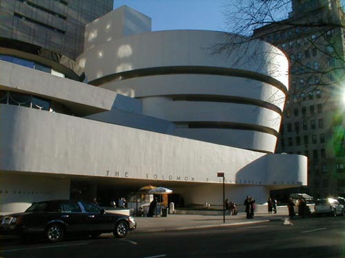
The New York Times posted a few articles regarding architecture, the first of which is a review and announcement of an exhibit titled, “Frank Lloyd Wright: From Within Outward," currently on display at the Solomon R. Guggenheim Museum in New York. The museum is celebrating its 50th anniversary and is commemorating the architect who designed it, Frank Lloyd Wright. The article says that, "Taken as a whole, the exhibition conveys not only the remarkable scope of his interests, which ranged from affordable housing to reimagining the American city, but also the astonishing cohesiveness of that vision..."

(Guggeneheim Museum by Frank Lloyd Wright)

As a former Frank Lloyd Wright fanatic, it sounds like an enviable exhibit, but perhaps not as exciting as the opening of the Renzo Piano designed Modern Wing of the Chicago Institute of Art. The article gives the building a favorable review citing that the museum, like other successful projects by Mr. Piano, has a wonderful interplay with light and a strong sense of interior space. Within the context of the city, the building also fits in with neighboring Millennium Park designed by Frank Gehry as well as the museum's original 1893 Beaux Arts structure.


(Chicago Art Institute by Renzo Piano)

The one negative point the article makes is in regards to Mr. Piano's style as a whole. "Many of his peers gripe that this is because of the subdued nature of his designs — sophisticated but not too threatening or unfamiliar — which seem tailored to ease the insecurities of museum boards." Mr. Piano, an Italian architect, is having a personal American renaissance designing civic structures all over the country, most notably, "...the renovation of the Morgan Library in Manhattan, a science center in San Francisco and museum additions in Los Angeles, Boston, Chicago and Fort Worth. (He even designed The New York Times Building.)" In an L.A. Times article, which I can't seem to find, an argument is made against Mr. Piano's middle of the road design principles and contends that the ubiquity of said principles in American civic design might lead to a very bland, homogenized architecture, especially in museums.

This fear is further echoed by a nearly unanimous panning of Mr. Piano's recent addition to the Los Angeles County Museum of Art (LACMA). The history of the museum's remodel is long and somewhat infamous (if one is so inclined to follow museum remodel scandals). As the article mentions, LACMA has had a troubled history, architecturally speaking, since it first opened in 1965 when tar started oozing into its fountains. A remodel was commissioned sometime in the 1980's that only further muddled the layout and architectural continuity of the site. In the early 2000's then LACMA president and director, Dr. Andrea Rich, set forth a giant fundraising campaign for yet another LACMA remodel. In 2002, after an international design competition was held, Dutch architect Rem Koolhaas was selected. His plan was to completely raze the current buildings and house the museum's entire collection under one massive glass roof. It was a bold move that most critics agreed was the right choice. However, due to logistical and financial problems the Koolhaas reconstruction was scrapped in favor of a tamer, less expensive remodel by Renzo Piano. In the middle of all this construction buzz, Dr. Andrea Rich stepped down as president and Michael Govan, president and director of the Dia Art Foundation in New York was chosen to be her replacement.

(Proposed LACMA remodel by Rem Koolhaas)


(Broad Contemporary Art Museum by Renzo Piano)

The first phase of the Renzo Piano designed project, the Broad Contemporary Art Museum, financed by home construction mogul and Los Angeles philanthropist Eli Broad, was opened in February 2008 to lukewarm critical reception. As with much of Mr. Piano's work, its interior space was complimented as feeling very open and filled with light and an area in which the art truly was the focus. The outside, however, remains as monolithic as the rest of the museum buildings, especially along Wilshire Blvd. A new entrance pavilion was created, in an attempt to reorient and strengthen the axis of the campus. This proved successful, but the building itself doesn't feel particularly inviting. As noted in a review of the the new building, "Mr. Piano’s design is remarkably uninspired. There is little of the formal freedom that is at the heart of the city’s architectural legacy; nor is there much evidence of the structural refinement that we have come to expect in Mr. Piano’s best work. The museum’s monumental travertine form and lipstick-red exterior stairways are a curious mix of pomposity and pop-culture references. It’s an architecture without conviction."

However, the new building is phase one of the development process. Part two is under construction and includes an amphitheater, a temporary exhibition space, and a plaza filled with palm trees. Sometime in the distant future there are also plans to do something about the existing buildings. What those plans might be and their effectiveness remains to be seen. All eyes are on phase two. Let's home Mr. Piano can dig a little deeper into his imagination and build something fitting for the ever experimental architectural landscape of Los Angeles.

More information and photos of the LACMA addition can be found at dvisible magazine.

For a closer look at Rem Koolhaas's design, check out Arcspace.

An interview with Renzo Piano conducted by Charlie "let-me-interrupt-you-for-the-thousandth-time" Rose can be seen here.

5.13.2009

Too Hip to be Square

I'm not sure how I stumbled across thisisnotikea.com, but I did and found it to be wonderful. The site, which sells retro and vintage furniture, is the brainchild of Angelenos, Alexis Hadjopulos and Tom Whitman. The two men roam around Los Angeles looking for unique pieces of retro and vintage furniture, buy them, and then resell the stuff on their site. Every piece of furniture is categorized and linked by type, color, and room. It's a simple, yet effective organization process that allows for easy perusal of hundreds of items. Hadjopulos and Whitman are constantly on the prowl for new items and update their site regularly.

The site seems to be attracting a lot of attention. Enough attention, in fact, that it is the subject of an article on the L.A. Times website. While this is great for the site, it's bad for me because I felt as if I had stumbled upon something special. Now, everyone and their vintage loving cousin will be looking at the site. I've never actually purchased anything from the TINI.com, but it felt like a secret find. It's like discovering a cool local restaurant just before everyone else does; before the foods becomes tasteless and the service turns slow. The good news, I guess, is that the Modernist aesthetic is being spread throughout the Southland and rare pieces are presumably going to deserving and saavy buyers. There's that, at least. Also, no one reads the paper anymore, so maybe the site will remain my little secret. I probably shouldn't have blogged about it, though. Oh well.

4.20.2009

McMansions: The Solution

As covered before in this blog, McMansions have become problematic in Los Angeles and other cities around the country for various reasons. My primary argument against McMansions is an aesthetic one because that's what I care and know the most about. There are various socio-economic arguments against the McMansion that I can't begin to explain, so I have provided links to people who can explain it. This last post in the series, while subtitled "The Solution" isn't meant to be a definitive answer, but one possibility. My primary concern/wish, as stated earlier, is stopping the construction of large and unattractive homes.

In Los Angeles, steps have been taken to make my wish come true. Thank you, Design Fairy! You really do exist!

As reported by Curbed LA back in May of 2008, homeowners got City Hall to pass an ordinance restricting the square footage of houses based on their lot size. Some residents feel the ordinance is too restrictive, claiming that the city is enacting a "one size fits all" policy that favors a minority while ignoring the needs of the majority. My argument would be that people feel entitled to more space than they actually need and the government is not banning large homes altogether, but ones that are disproportionately large compared to their lot size.

As early as 2005, the New York Times heralded the end of the McMansion craze for several reasons. One of which is that the cost of furnishing/maintaining such huge houses is enormous and beyond people's means. A second reason is attributed to the rise in interest rates, which makes home buying a large home less feasible. Lastly, and most telling, is that the large homes have become associated with greed, especially after the recent economic corporate scandals.

The consumerist tendency of the American people seems to being tempered a bit by economic woes and (gasp) maybe even environmental ones too. One of the last reasons the New York Times cites as a reason for the return to smaller homes was the perception that building large homes is wasteful and damaging to the environment. Incidentally, these are some of the very arguments being brought against U2 guitarist, the Edge, who wants to build a large cliff side house in Malibu, California.

The downsizing trend can be seen in KB Home, one of the largest home builders in the country. As a Fortune article highlights, the construction boom of the early 90's has died down and people no longer desire or can afford the larger houses they once did. Responding to the home buyers' new needs and desires, KB Home is shrinking the size of their homes and lowering the cost.

Regardless of my aesthetic opinions, I think the slow phasing out of McMansions is a positive sign. One of my primary beefs with the McMansions is that, while ugly in their own right, their presence also mars the surrounding neighborhood and shows a certain selfishness on the home owner's part. They are are thinking only of what they want and not how such changes will affect the rest of the community, both aesthetically and economically.

I am a big believer in moderation and harmony. Home owners' desires to have smaller homes, to me, represents a greater social consciousness. People are not only considering their own needs, but problems like the environment, or neighbors' property values, or how much space a family really needs to live comfortably. Sure, some floor plans are shrinking because people simply can't afford anything bigger, but there are still many others who are able to go big and choose not to. Sometimes looking at the big picture allows one to see that it's the small things that are most important.

3.25.2009

McMansions: The Threat

As my previous posts clearly states, McMansions are hideous and a complete affront to people with even a moderate sense of aesthetics. In this post, I will elaborate on why, aesthetically, McMansions are so horrid and discuss their effect on the social behavior of their residents.

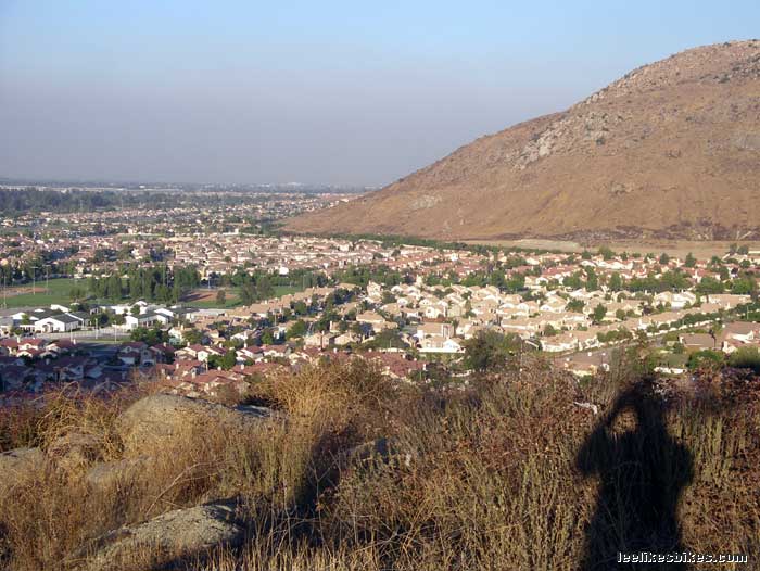
To again reference my previous post, it's obvious that McMansions are pretty similar. The floor plans may change from house to house and the color of the kitchen tile may be different, but they're all, essentially, variations on a theme, and a bland theme at that. As far as I can tell, what the below photo shows is a lot of white houses with fake Spanish tile roofs. Even if you like the style of the house, which can be alluring, does the house still retain that allure when there are thousands like it just down the street?


While McMansions are being built all around the country, I feel that Los Angeles is the most tragic/ironic victim of the trend. Los Angeles has long been considered one of the most architecturally inventive cities in the country. The trend can be traced back to at least the early 1900's with the Arts and Crafts style homes built by Greene & Greene. In the 1920's Austrian architect, Rudolph Schindler, expiremented with poured concrete and tilt wall construction while building his King's Road House. Los Angeles is also home to Frank Lloyd Wright's textile block experiments including the Freeman House, the Ennis-Brown House, and the Alice Millard House. Famed architect, Richard Neutra, also built many homes in the Silver Lake and Griffith Park area, including the Lovell House. The building trend continued into the 50's and 60's with the advent of Googie architecture and the Case Study Program, not to mention John Lautner and his beloved Chemosphere and the Sheats-Goldstein House(perhaps you've seen them in movies...Charlie's Angels, The Big Lebowski, Fiona Apple's music video for the song, "Criminal."). Now, Frank Gehry calls Santa Monica home and builds giant binoculars along the beach. And this is only a partial list.

The point of all this is to say that Los Angeles is an architecturally diverse city that is losing its heritage and identity by succumbing to prefab housing. Fullerton, a city south of Los Angeles, in Orange County, has a great architectural heritage site, highlighting all the styles that have flourished in Fullerton, as well as Los Angeles. These homes are the very kind that are being replaced by the McMansion and their "boxy is better" aesthetic. Even if you don't like the styles showcased on the site, you have to admit they're different. Each one has its own set of characteristics and details. There is a uniqueness to each style that is lacking in McMansion designs. If nothing else, one can at least argue against the McMansion because of its uniformity.

The ironic part of the Los Angeles McMansion construction boom is that many of the homes are built by KB Home, who as of 2001, was the no. 2 home builder in the country. What's so ironic about this? The "B" in KB home stands for Broad, as in Eli Broad, the Los Angeles based philanthropist who, most recently, gave Los Angeles' Museum of Contemporary Art a $30-million bailout. He is also the namesake and chief financial contributor of the Los Angeles County Museum of Art's new, Broad Contemporary Art Museum. I find it odd that a man who makes his money building pre-fabricated homes would also collect Jeff Koons sculptures and Andy Warhol paintings. It's like being a cardiologist who smokes. He has given millions to fund the arts in Los Angeles, so I guess I shouldn't complain.

The building of tract homes is, of course, not just limited to L.A. and neither are the problems associated with them. As stated before, one of the major problems with McMansions is how aesthetically displeasing they are. A 2006 Slate article reviews some of the major design flaws associated with McMansions. Another article, this one in Newsweek, tells of how ill designed McMansions are and how home buyers are beginning to recognize this fact.

"I think there's a return to an interest in modernism," says New York architect Deborah Berke, "and I would call it warm modernism, not sleek minimalism." She argues that a younger generation, steeped in a love of cool design and loft living and ready for a first house, isn't going to buy a mini-McMansion.
And it's not on the style conscious that are against these big homes. "The eco-conscious hate big houses, too, with the energy cost of heating and cooling all those big empty rooms."

The last issue I have with McMansions, although it is a problem with suburban sprawl in general, is the high level of obesity in the suburbs. With miles and miles of homes, and no urban center in sight, people are more reliant on cars. More driving means less walking and less walking means bigger waistlines. Housing divisions rarely include any sort of civic center. The formerly ubiquitous Main Street U.S.A. is slowly disappearing and being replaced by malls. This trend began in the 1960's with the advent of the shopping center.

McMansion
communities don't have a main street containing local stores. Instead, the local shopping center, located outside the subdivision, has everything a person could need. The problem with this model is that the shopping center is its own entity, distanced from the surrounding neighborhood by a giant parking lot and generally deserted when not open. If the stores were on a city's main street they would be integrated into the community and would have local foot traffic. People would recognize each other on the street, perhaps converse. Larger shopping centers, because they serve a larger area, lack the personal intimacy of a local main street. While all this may seem like nostalgia for some 1950's suburban ideal, there is truth to the idea that architecture and urban planning affect how people behave/socialize and how that behavior, in turn, affects the fate of the community.

A site hosted by Cornell has a list critical essays outlining the history of urban planning from 1794, all the way up to World War I.

A post on ZNet argues that there is a correlation between urban sprawl and the growing obesity epidemic in the United States.

An article in the Atlantic talks about the rise in popularity of urban living and what this means for the once popular suburbs.


Bad design, potential health problems, and social interaction all play a role in the rise and fall of the McMansion. Now that the initial wow-factor of cheaply built homes is beginning to wear off, people are fighting against the McMansion. As always, Los Angeles is leading the trend with a series of laws prohibiting the huge houses to be built. This, along with other anti-McMansion trends, will be covered in the third and final post in this series.

3.22.2009

McMansions: Identification

This is the first in a series of posts about McMansions, urban planning, and the slow backlash against the Mc Mansions. The series will focus primarily on the Mc Mansion craze in Los Angeles, since that's where I live, but I believe the information will be relevant to anyone who lives in or around a Mc Mansion neighborhood (which, sadly, is everyone at this point).


Mc Mansions are probably one of the worst plagues brought upon this country since the introduction of smallpox. And, just like smallpox, there is little chance of escaping McMansions. They pop up everywhere, without warning. Suddenly, whole blocks are infested with unsightly houses towering over the rest of the neighborhood. In L.A., McMansions are quickly becoming the norm. Modest, post-war tract homes are being replaced by bland, boxy behemoths with no backyards and a front lawn paved over with concrete.

In developing neighborhoods, especially east of L.A., out towards Rancho Cucamonga, whole McMansion developments are being built. Vast tracts of land along the foothills are being covered in beige colored homes with burnt orange tiles roofs, and fluorescent green lawns. The uniformity of design, when looked at from afar, is disgusting. If you are unfamiliar with the Mc Mansions, please refer to the photos below, which I personally took. None of them are more than 10 minutes away from me. Watch out, they may be closer to you than you think.


Exhibit A

Classic McMansion. Notice the scale of the house compared to the others on the street. There is also a ridiculously sized porch overhang and unadorned, cinder block wall, topped with excessive grill work. Another staple of the McMansion is its lack of grace and proportion. The second story is not well integrated into the structure, but rather plopped on top. The lack of variation in form, especially in the roof line, make for a boring and unsightly mess in an otherwise pleasant block of houses.


Exhibit B

This house also has an unnecessarily large entry covering, as well as a heavily decorated door, complete with beveled glass. The columns and glass wall on the balcony are incongruous with the home's other design elements. The house's flat front also make it look imposing. Notice how the house to the left has a gable, giving the front of the house and the roof line more dimension. The McMansion is also completely stuccoed and painted a pale peach color, which is typical of their type.


Exhibit C

This McMansion, while unacceptable, is better than the previous two. Its entryway is not as ostentatious and its front yard is neatly landscaped. Still, it suffers from a flat, box front, non-descript color, and pushes the limit of its lot size. Notice how much smaller the McMansion's lawn is compared to its neighbor's. This McMansion has included some stonework, which gives the front some texture, but it placement seems arbitrary. Plus, I would put money on the fact that those stones are fake.